
Table of Contents
Bar graphs- Examples
- Reading a Bar Graph – Example
- Summary
- What’s Next
In the previous segment, we saw how to select the best scale. In this segment, we will learn more about the bar graphs through an example.
Example:
Let’s see a practical example where the bar graph can be used to understand data more easily.
Following bar graph shows the data for the average temperature of 6 cities; A, B, C, D, E and F in (∘? ). Average temperatures of the cities are marked on the vertical axis as shown below.
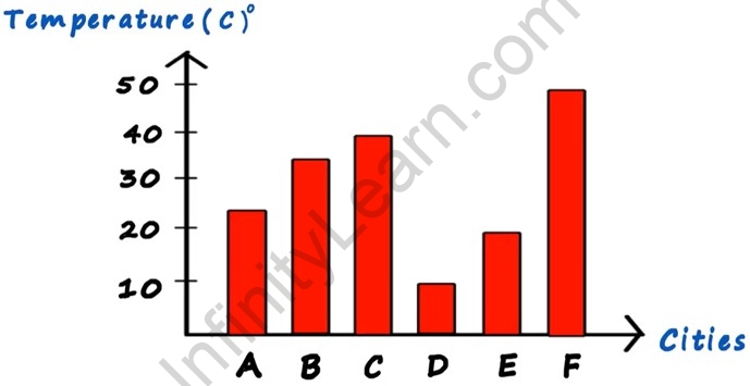
Based on the given bar graph, answer the following questions.
1. Which is the hottest city among these 6 cities?
Ans: City F. If you take a glance at the bar graph then the bar corresponding to City F is the tallest amongst all ( 50∘?). Hence, City F is the hottest city.
