
Table of Contents
Practical Work in Geography Class 12 Solutions Chapter 3 Graphical Representation of Data
Class 12 Practical Work in Geography Chapter 3 NCERT Textbook Questions Solved
1. Choose the right answer from the four alternatives given below:
Question1(i).
Which one of the following map shows the population distribution?
(a) Choropleth maps
(b) Isopleth maps
(c) Dot maps
(d) Square root map
Answer:
(c) Dot maps
Question1(ii).
Which one of the following is best suited to represent the decadal growth of population?
(a) Line graph
(b) Bar diagram
(c) Circle diagram
(d) Flow diagram
Answer:
(a) Line Graph
Question1(iii).
Polygraph is constructed to represent:
(a) Only one variable
(b) Two variables only
(c) More than two variables
(d) None of the above
Answer:
(c) More than two variables
Question1(iv).
Which one of the following maps is known as “Dynamic Map”?
(a) Dot map
(b) Choropleth
(c) Isopleth
(d) Flow map
Answer:
(d) Flow map
2. Answer the following questions in about 30 words:
Question 2(i).
What is a thematic map?
Answer:
Maps drawn to study a particular theme like rainfall, temperature, soil type, etc. is called a thematic map. Thematic maps, graphs and diagrams serve a useful purpose in providing a comparison between the internal variations within the data of different characteristics represented.
Question 2(ii).
Differentiate between multiple bar diagram and compound bar diagram.
Answer:
Multiple Bar Diagram: Multiple bar diagrams are constructed to represent two or more than two variables for the purpose of comparison.
For example, we can draw two bars one indicating literacy rate of males and other literacy rate of females.
Compound Bar Diagram: When different components are grouped in one set of variables or different variables of one component are put together, their representation is made by a compound bar diagram. In this method, different variables are shown in a single bar with different rectangles.
For example, total electricity produced in India is sub-divided into hydro power, thermal power, nuclear power, etc.
Question 2(iii).
What are the requirements to construct a dot map?
Answer:
The dot maps are drawn to show the distribution of phenomena such as population, cattle, types of crops, etc. The dots of same size as per the chosen scale are marked over the given administrative units to highlight the patterns of distribution.
Requirements:
- An administrative map of the given area showing state/district/block boundaries.
- Statistical data on selected theme for the chosen administrative units, i.e. total population, cattle, etc.
- Selection of a scale to determine the value of a dot.
- Physiographic map of the region especially relief and drainage maps.
Precautions:
- The lines demarcating the boundaries of various administrative units should not be very thick and bold.
- All dots should be of same size.
Question 2(iv).
Describe the method of constructing a traffic flow map.
Answer:
Traffic flow map is a combination of graph and map. It is drawn to show the flow of commodities or people between the places of origin and destination. It is also called Dynamic Map. Transport map, which shows number of passengers, vehicles, etc., is the best example of a flow chart. These charts are drawn using lines of proportional width. Many government agencies prepare traffic flow maps to show density of the means of transportation on different routes.
Methods for the Preparation of a Traffic Flow Map:
- A route map depicting the desired transport routes along with the connecting stations.
- The data pertaining to the flow of goods, services, number of vehicles, etc. along with the point of origin and destination of the movements.
- The selection of a scale through which the data related to the quantity of passengers and goods or the number of vehicles is to be represented.
Question 2(v).
What is an Isopleth map? How an interpolation is carried out?
Answer:
The word Isopleth is derived from Iso meaning equal and pleth means lines. Thus, an imaginary line, which joins the places of equal values, is referred as Isopleth.The more frequently drawn isopleths include Isotherm (equal temperature), Isobar (equal pressure), Isohyets (equal rainfall), Isonephs (equal cloudiness), Isohels (equal sunshine), contours (equal heights), Isobaths (equal depths), Isohaline (equal salinity), etc. Interpolation is used to insert the intermediate values between the observed values of two stations/locations, such as temperature recorded at Chennai and Hyderabad or the spot heights of two points. Generally, drawing of isopleths joining the places of the same value is also termed as interpolation.
Methods of Interpolation:
- Firstly, determine the minimum and maximum values given on the map.
- Calculate the range of value, i.e. range = maximum value – minimum value.
- Based on range, determine the interval in a whole number like 5, 10, 15, etc.
- The exact point of drawing an isopleth is determined by using the following formula
![]()
Question 2(vi).
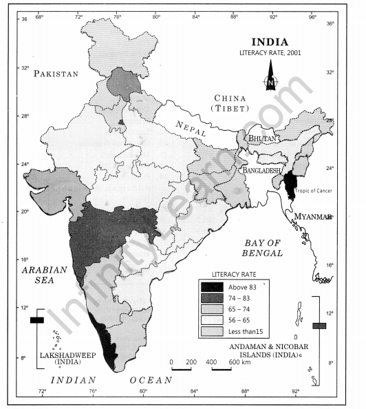
Describe and illustrate important steps to be followed in preparing a Choropleth map.
Answer:
The Choropleth maps are drawn to prepare the characteristics of data as they are related to the administrative units. These means are used to represent the literacy rate, sex ratio and density of population.
Steps to be followed:
- Arrange the data in ascending or descending order.
- Group the data into 5 categories to represent very high, high, medium, low and very low concentrations.
- The interval between the categories may be identified on the following formula, i.e. Range/5 and Range = maximum value – minimum value.
- Patterns, shades or colour to be used to depict the chosen categories should be marked in an increasing or decreasing order.
| Original Data on Literacy in India | ||
| SI.No. | States/Union territories | Literacy Rate |
| 1. | Jammu 8s Kashmir | 55.5 |
| 2. | Himachal Pradesh | 76.5 |
| 3. | Punjab | 69.7 |
| 4. | Chandigarh | 81.9 |
| 5. | Uttarakhand | 71.6 |
| 6. | Haryana | 67.9 |
| 7. | Delhi | 81.7 |
| 8. | Rajasthan | 60.4 |
| 9. | Uttar Pradesh | 56.3 |
| 10. | Bihar | 47.0 |
| 11. | Sikkim | 68.8 |
| 12. | Arunachal Pradesh | 54.3 |
| 13. | Nagaland | 66.6 |
| 14. | Manipur | 70.5 |
| 15. | Mizoram | 88.8 |
| 16. | Tripura | 73.2 |
| 17. | Meghalaya | 62.6 |
| 18. | Assam | 63.3 |
| 19. | West Bengal | 68.6 |
| 20. | Jharkhand | 53.6 |
| 21. | Odisha | 63.1 |
| 22. | Chhattisgarh | 64.7 |
| 23. | Madhya Pradesh | 63.7 |
| 24. | Gujarat | 69.1 |
| 25. | Daman & Diu | 78.2 |
| 26. | Dadra 8s Nagar Haveli | 57.6 |
| 27. | Maharashtra | 76.9 |
| 28. | Andhra Pradesh | 60.5 |
| 29. | Karnataka | 66.6 |
| 30. | Goa | 82.0 |
| 31. | Lakshadweep | 86.7 |
| 32. | Kerala | 90.9 |
| 33. | Tamil Nadu | 73.5 |
| 34. | Puducherry | 81.2 |
| 35. | Andaman & Nicobar Islands | 81.3 |
| Original Data on Literacy in India | ||
| SI.No. | States/Union territories | Literacy Rate |
| 10. | Bihar | 47.0 |
| 20. | Jharkhand | 53.6 |
| 12. | Arunachal Pradesh | 54.3 |
| 01. | Jammu 8s Kashmir | 55.5 |
| 9. | Uttar Pradesh | 56.3 |
| 26. | Dadra 8s Nagar Haveli | 57.6 |
| 08. | Rajasthan | 60.4 |
| 28. | Andhra Pradesh | 60.5 |
| 17. | Meghalaya | 62.6 |
| 21. | Odisha | 63.1 |
| 18. | Assam | 63.3 |
| 23. | Madhya Pradesh | 63.7 |
| 22. | Chhattisgarh | 64.7 |
| 13. | Nagaland | 66.6 |
| 29. | Karnataka | 66.6 |
| 06: | Haryana | 67.9 |
| 19. | West Bengal | 68.6 |
| 11. | Sikkim | 68.8 |
| 24. | Gujarat | 69.1 |
| 03. | Punjab | 69.7 |
| 14. | Manipur | 70.5 |
| 05. | Uttarakhand | 71.6 |
| 16. | Tripura | 73.2 |
| 33. | Tamil Nadu | 73.5 |
| 02. | Himachal Pradesh | 76.5 |
| 27. | Maharashtra | 76.9 |
| 25. | Daman & Diu | 78.2 |
| 34. | Puducherry | 81.2 |
| 35. | Andaman & Nicobar Islands | 81.3 |
| 07. | Delhi | 81.7 |
| 04. | Chandigarh | 81.9 |
| 30. | Goa | 82.0 |
| 31. | Lakshadweep | 86.7 |
| 15. | Mizoram | 88.8 |
| 32. | Kerala | 90.9 |
Construction:
- Arrange the data in ascending order as shown above.
- Identify the range within the data. The states recording the lowest and highest literacy rates are Bihar (47%) and the Kerala (90.9%) respectively. Hence, the range would be 91.0 – 47.0 = 44.0.
- Divide the range by 5 to get categories from very low to veiy high. (44.0/ 5 = 8.80. We can convert this value to a round number say 9.0.
- Determine the number of the categories along with range of each category. Add 9.0 to the lowest value of 47.0 as so on.
Following categories will be obtained:
(i) 47 – 56
Very low (Bihar, Jharkhand, Arunachal Pradesh, Jammu and Kashmir)
(ii) 56 – 65
Low (Uttar Pradesh, Rajasthan, Andhra Pradesh, Meghalaya,
Odisha, Assam, Madhya Pradesh, Chhattisgarh)
(iii) 65 – 74
Medium (Nagaland, Karnataka, Haryana, West Bengal, Sikkim, Gujarat, Punjab, Manipur, Uttarakhand, Tripura, Tamil Nadu)
(iv) 74 – 83
High (Himachal Pradesh, Maharashtra, Delhi, Goa)
(v) 83 – 92
Very High (Mizoram, Kerala)
- Assign the shades/pattern to each category ranging from lower to higher hues
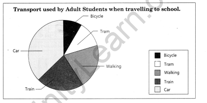
Question 2(vii).
Construct a pie chart with this information.
Students in an adult school were surveyed about the type of transport they use to travel to school.
The results were:
Walking 3, Train 6, Tram 9, Car 10, Bicycle 12.
pie chart
Total Population of Students=40
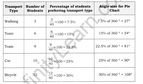
Total Population of Students=40
ACTIVITY
Question 1.
Represent the following data with the help of suitable diagram.
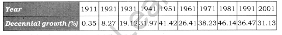
Answer:
Range of the data = 46.14 – 0.35=45.79
Line graph will be the right method to present these data.
Question 2.
Represent the following data with the help of suitable diagram.
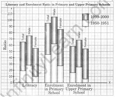
India: Literacy and Enrolment Ratio in Primary and Upper Primary Schools
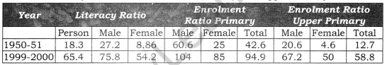
Answer:
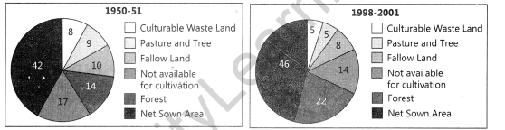
Question 3.
Represent the following data with help of pie-diagram.
India: Land use 1951-2001
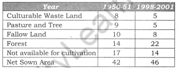
Answer:
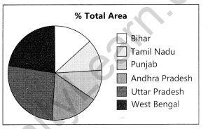
Question 4.
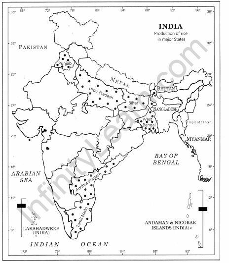
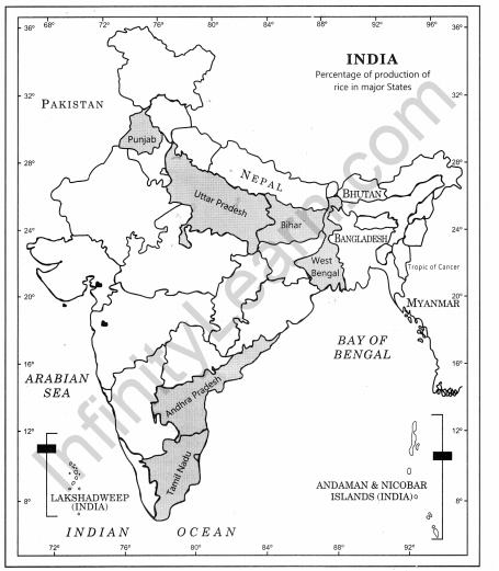
Study the table given below and draw the given diagrams/maps.
Area and Production of Rice in Major States
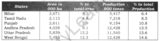
Construct a multiple bar diagram to show area under rice in each state.
Construct a pie-diagram to show the percentage of area under rice in each state.
Construct a dot map to show the production of rice in each state.
Construct a Choropleth map to show the percentage of production of rice in states.
Answer:
(a)
(b)
(c)
(d)
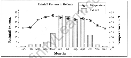
Question 5.
Show the following data of temperature and rainfall of Kolkata with a suitable diagram.
| Months | Temperature in 0C | Rainfall in cm |
| Jan. | 19.6 | 1.2 |
| Feb. | 22.0 | 2.8 |
| Mar. | 27.1 | 3.4 |
| Apr. | 30.1 | 5.1 |
| May | 30.4 | 13.4 |
| June | 29.9 | 29.0 |
| Jul. | 28.9 | 33.1 |
| Aug. | 28.7 | 33.4 |
| Sep. | 28.9 | 25.3 |
| Oct. | 27.6 | 12.7 |
| Nov. | 23.4 | 2.7 |
| Dec. | 19.7 | 0.4 |
Answer:


Class 12 Practical Work in Geography Chapter 3 NCERT Extra Questions
Class 12 Practical Work in Geography Chapter 3 Very Short Answer Type Questions
Question 1.
What are data? How are these important?
Answer:
Numerical and quantitative measurement of geographical events, human activities and their interrelationship are called data. In other words, quantitative information is called datum. Therefore, data are also called quantitative information.
Question 2.
What is the Chinese proverb in context of diagrams, graphs and maps?
Answer:
There is a Chinese proverb that ‘a picture is equivalent to thousands of words’. Hence, the graphic method of the representation of data enhances our understanding, and makes the comparisons easy.
Question 3.
Why is statistics needed?
Answer:
Statistics are used by geographers, economists, statisticians, resource scientists, planners, decision-makers and some other persons who need to do comparative study and to derive findings.
Question 4.
What are the general rules related to construction of graphs, maps and diagrams?
Answer: General rules for drawing graphs, maps and drawing are:
(a) Selection of a Suitable Method
(b) Selection of Suitable Scale
(c) Design: It includes title, legend, and direction.
Question 5.
Name the most commonly used graphs and maps.
Answer:
The most commonly drawn diagrams and maps and the way they are constructed are:
(a) Line graphs
(b) Bar diagrams
(c) Pie-diagram
(d) Wind rose and star diagram
(e) Flow charts
Question 6.
When are thematic maps drawn?
Answer: Thematic maps, graphs and diagrams serve a useful purpose in providing a comparison between the internal variations within the data of different characteristics represented.
Question 7.
What are different types of quantitative thematic maps?
Answer:
There are three types of quantitative thematic maps:
(a) Dot map
(b) Choropleth map
(c) Isopleth map
Question 8.
What are dot maps?
Answer:
The dot maps are drawn to show the distribution of phenomena such as population, cattle, types of crops, etc. The dots of same size as per the chosen scale are marked over the given administrative units to highlight the patterns of distribution.
Question 9.
What are choropleth maps?
Answer:
The choropleth maps are also drawn to depict the data characteristics as they are related to the administrative units. These maps are used to represent the density of population, literacy/growth rates, sex-ratio, etc.
Question 10.
What are more frequently drawn isopleths?
Answer:
The more frequently drawn isopleths include isotherm (equal temperature), isobar (equal pressure), isohyets (equal rainfall), isonephs (equal cloudiness), isohels (equal sunshine), contours (equal heights), isobaths (equal depths), isohaline (equal salinity), etc.
Question 11.
Why is a flow map called a dynamic map?
Answer:
Flow map is drawn to show the flow of commodities or people between the places of origin and destination. Since it shows many variables together and deals with flow phenomenon, it is also called dynamic map.
Class 12 Practical Work in Geography Chapter 3 Short Answer Type Questions
Question 1.
In how many categories are maps and graphs used to present data?
Answer:
The diagrams and the maps to represent data can be grouped into the following types:
(a) One-dimensional diagrams such as line graph, polygraph, bar diagram, histogram, age, sex, pyramid, etc.;
(b) Two-dimensional diagram such as pie-diagram and rectangular diagram;
(c) Three-dimensional diagrams such as cube and spherical diagrams.
Question 2.
What do you mean by isopleth?
Answer:
The word Isopleth is derived from. Iso means equal and pleth means lines. Thus, an imaginary line, which joins the places of equal values, is referred to as isopleth. The more frequently drawn isopleths include isotherm (equal temperature), isobar (equal pressure), isohyets (equalrainfall), isonephs (equal cloudiness), isohels (equal sunshine), contours (equal heights), isobaths (equal depths), isohaline (equal salinity), etc.
Question 3.
What is a line graph? For which type of data are they used?
Answer:
In line graph data are presented using a line on graph paper. The line graphs are usually drawn to represent the time series data related to the temperature, rainfall, population growth, birth rates and death rates.
More than one variable can also be presented through line graph to do a comparative analysis. For example, temperature and pressure of an area can be presented in the same graph to make a comparison.
Class 12 Practical Work in Geography Chapter 3 Long Answer Type Questions
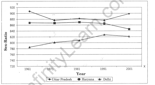
Question 1.
How are data presented using ploygraphs?
Answer:
Polygraph is a line graph in which two or more than two variables are shown by an equal number of lines for an immediate comparison, such as the growth rate of different crops like rice, pulses or the birth rates and life expectancy or sex ratio in different states or countries. A different line pattern such as straight line(___), broken
line (—) dotted line(….) or a combination of dotted and broken line (…–…) or line of
different colours may be used to indicate the value of different variables.
| States/UT | Years | 2001 | |||
| 1961 | 1971 | 1981 | 1991 | ||
| Delhi | 785 | 801 | 808 | 827 | 821 |
| Haryana f.V ‘ | 868 | 867 | 870 | 86 | 846 |
| Uttar Pradesh | 907 | 876 | 882 | 876 | 898 |
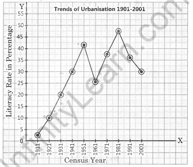
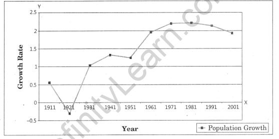
Question 2.
Define and construct a line graph to represent the growth rate of population in India during 1901-2001.
Answer:
The line graph is drawn to represent the time series data related to temperature, rainfall, population growth, birth rates, etc.
| Year | 1901 | 1911 | 1921 | 1931 | 1941 | 1951 | 1961 | 1971 | 1981 | 1991 | 2001 |
| Growth rate (in %) | 0.56 | -0.30 | 1.04 | 1.33 | 1.25 | 1.96 | 2.20 | 2.22 | 2.14 | 1.93 |
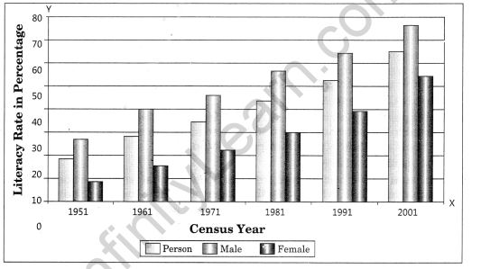
Question 3.
Draft a multiple bar diagram.
Answer:
Multiple bar diagram is constructed to represent two or more than two variables for the purpose of comparison.
| Year | Literacy Rate | ||
| Total Population | Male | Female | |
| 1951 | 18.33 | 27.16 | 8.86 |
| 1961 | 28.3 | 40.4 | 15.35 |
| 1971 | 34.45 | 45.96 | 21.97 |
| 1981 | 43.57 | 56.38 | 29.76 |
| 1991 | 52.21 | 64.13 | 39.29 |
| 2001 | 64.84 | 75.85 | 54.16 |
Class 12 Practical Work in Geography Chapter 3 Viva Questions
Question 1.
In which case histogram is prepared?
Answer:
Continuous series
Question 2.
In what type of graph comparison among the class frequencies is possible?
Answer:
Histogram
Question 3.
Data represented through a histogram can help in finding graphically which measure of central tendency?
Answer:
Mode
Question 4.
Histogram is drawn on what?
Answer:
Graph paper
Question 5.
To find the number of observations less than any given value, we use what type of frequency?
Answer:
Cumulative frequency distribution.
Question 6.
While preparing time series graph, we show which variable on the X-axis?
Answer:
Time
Question 7.
By which type of graph Mode is found graphically?
Answer:
Histogram
Question 8.
A simple frequency distribution of a discrete variable is represented by what?
Answer:
Line Graph
Question 9.
How is a frequency polygon obtained?
Answer: By constructing a frequency histogram and linking the mid-points from a frequency histogram.
Question 10.
Ogives can be helpful in locating graphically which measure of central tendency?
Answer:
Median
Question 11.
Ogive curve can be drawn for which type of frequency?
Answer:
For More than type distribution and Less than type distribution of commulative frequency.
Question 12.
In which graph the breadth of a rectangle is equal to the length of the class-interval?
Answer:
Histogram
Question 13.
What are Dot maps?
Answer:
The dot maps are drawn to show the distribution of phenomena such as population, cattle, types of crops, etc. The dots of same size as per the chosen scale are marked over the given administrative units to highlight the patterns of distribution.
Question 14.
What is Choropleth Map?
Answer:
Choropleth maps are also drawn to depict the data characteristics as they are related to the administrative units. These maps are used to represent the density of population, literacy/growth rates, sex-ratio, etc.
Question 15.
What is an Isopleth Map?
Answer:
The word Isopleth is derived from Iso means equal and pleth means lines. Thus, an imaginary line, which joins the places of equal values, is referred to as Isopleth. The more frequently drawn isopleths include Isotherm (equal temperature), Isobar (equal pressure), Isohyets (equal rainfall), Isonephs (equal cloudiness), Isohels (equal sunshine), contours (equal heights), Isobaths (equal depths), Isohaline (equal salinity), etc.
Graphical Representation of Data Notes
- Data can be presented either in text or tabular or semi-tabular or diagrams or graphs or pictures. Diagrams and graphs are more efficient than any other method. Graphs and charts occupy an important place in statistical analysis and inferences. Data are dry and dull for most of the people. It becomes attractive and impressive through diagrammatic and graphical presentation.
- The transformation of data through visual methods like graphs, diagrams, maps and charts is called representation of data.
- Data can be compared and meaningful results can be derived from well-organised and presented data.
- The geographers, economists, resource scientists and the decision-makers use a lot of data these days. Besides the tabular form, the data may also be presented in some graphic or diagrammatic form.
- There is a Chinese proverb that ‘a picture is equivalent to thousands of words’. Hence, the graphic method of the representation of data enhances our understanding, and makes the comparisons easier.
- In Geography, we use presentation of data to understand the patterns of population growth, distribution and the density, sex ratio, age-sex composition, occupational structure, etc. within a geographical territory.
- General rules for drawing graphs, maps and drawing are:
(a) Selection of a Suitable Method
(b) Selection of Suitable Scale
(c) Design—It includes title, legend, and direction. - The data possess measurable characteristics such as length, width and volume. The diagrams and the maps that are drawn to represent these data related characteristics may be grouped into the following types:
(a) One-dimensional diagrams such as Line Graph, polygraph, bar diagram, histogram, age, sex, pyramid, etc.
(b) Two-dimensional diagrams such as pie diagram and rectangular diagram.
(c) Three-dimensional diagrams such as cube and spherical diagrams. - The most commonly drawn diagrams and maps and the way they are constructed are:
(a) Line graphs
(b) Bar diagrams
(c) Pie diagram
(d) Wind rose and star diagram
(e) Flow charts - Thematic maps, graphs and diagrams serve a useful purpose in providing a comparison between the internal variations within the data of different characteristics represented.
Graphical Representation of Data Important Terms
- Title: The title of the diagram/map indicates the name of the area, reference year of the data used and the caption of the diagram. These components are represented using letters and numbers of different font sizes and thickness. Besides, their placing also matters. Normally, title, subtitle and the corresponding year are shown in the centre at the top of the map /diagram.
- Legend: A legend or index is an important component of any diagram/map. It explains the colours, shades, symbols and signs used in the map and diagram. It should also be carefully drawn and must correspond to the contents of the map/diagram. Besides, it also needs to be properly positioned. Normally, a legend is shown either at the lower left or lower right side of the map sheet.
- Line Graph: The line graphs are usually drawn to represent the time series data related to the temperature, rainfall, population growth, birth rates and death rates.
- Multiple Bar Diagram: Multiple bar diagrams are constructed to represent two or more than two variables for the purpose of comparison.
- Compound Bar Diagram: When different components are grouped in one set of variable or different variables of one component are put together, their representation is made by a compound bar diagram. In this method, different variables are shown in a single bar with different rectangles.
- Quantitative Maps: Maps depicting quantitative variables like areas receiving more than 200 cm, 100 to 200 cm, 50 to 100 cm and less than 50 cm of rainfall are referred as quantitative maps. These maps are also called statistical maps.
- Qualitative Maps: Map depicting non-measurable characteristics in the distribution of given information such as a map showing high and low rainfall-receiving areas are called non quantitative maps. These maps are also called qualitative maps.
- Dot maps: The dot maps are drawn to show the distribution of phenomena such as population, cattle, types of crops, etc. The dots of same size as per the chosen scale are marked over the given administrative units to highlight the patterns of distribution.
- Choropleth Map: The choropleth maps are also drawn to depict the data characteristics as they are related to the administrative units. These maps are used to represent the density of population, literacy/growth rates, sex-ratio, etc.
- Isopleth Map: The word ‘Isopleth’ is derived from Iso means equal and pleth means lines. Thus, an imaginary line, which joins the places of equal values, is referred as Isopleth. The more frequently drawn Isopleths include Isotherm (equal temperature), Isobar (equal pressure), Isohyets (equal rainfall), Isonephs (equal cloudiness), Isohels (equal sunshine), contours (equal heights), Isobaths (equal depths), Isohaline (equal salinity), etc.
