


Courses

By Swati Singh
|
Updated on 1 Aug 2025, 14:42 IST
An analytical paragraph is a key element in academic writing, especially for students in class 10. This type of paragraph involves dissecting a topic to understand its various components. Analytical paragraph class 10 focuses on teaching students to structure their analysis coherently. When learning how to write an analytical paragraph, students must focus on clarity and precision.
Analytical paragraph class 10 examples and analytical paragraph class 10 solved examples pdf are valuable resources for understanding this format. These examples often include tasks like writing an analytical paragraph on a bar graph or an analytical paragraph pie chart, which are common in analytical paragraph class 10 CBSE syllabus.
The analytical paragraph class 10 format typically includes an introduction, evidence or examples, and a conclusion. This paragraph writing format is essential for students to articulate their thoughts clearly.
Overall, mastering the analytical paragraph format is crucial for students in class 10th, as it enhances their critical thinking and writing skills.
In educational settings, particularly in analytical paragraph class 10, students are introduced to various types. For instance, an analytical paragraph on a bar graph or an analytical paragraph pie chart are common types where students analyze graphical data. These forms are integral to the analytical paragraph class 10 CBSE curriculum.
Each type of analytical paragraph requires a specific approach but follows a general analytical paragraph format. Understanding these types is crucial for students, especially in class 10th, as they provide a foundation for critical thinking and effective communication.
To write an analytical paragraph, it's essential to understand its structure and purpose. An analytical paragraph focuses on breaking down a topic into its key elements and discussing each one in detail. This type of paragraph is especially important in educational settings, such as in class 10, where students are often required to analyze texts, data, or graphs.
Here's a step-by-step guide to how to write an analytical paragraph:

For more guidance, students can refer to analytical paragraph class 10 solved examples or analytical paragraph class 10 solved examples pdf. These resources provide practical examples that follow the analytical paragraph format and paragraph writing format.
The analytical paragraph format is a structured approach to writing that focuses on breaking down a topic to understand and explain its various components. For practical understanding, analytical paragraph class 10 solved examples and analytical paragraph class 10 solved examples pdf are excellent resources. These examples show class 10 analytical paragraph in action, often including tasks like writing an analytical paragraph on a bar graph or an analytical paragraph pie chart, as found in the analytical paragraph class 10 CBSE syllabus.
For students seeking guidance, analytical paragraph class 10 solved examples or analytical paragraph class 10 solved examples pdf can be excellent for class 10 CBSE students requirements and help in understanding the format. Here are more than 10 examples of analytical paragraph for class 10
Below we have discussed analytical paragraph solved examples for class 10 students
Eg: 1 The pie chart shows the proportion of people from different households living in poverty in the UK in 2002. Write an analytical paragraph to describe the information in 100-120 words.
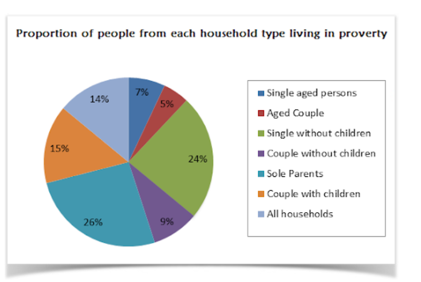
Answer: The pie chart provides a clear depiction of poverty distribution among different household types in the UK in 2002. Notably, single-parent households represent 26% of all poverty-affected families, marking them as the most vulnerable group. Following closely are single individuals without children, making up 24% of the impoverished households. This contrasts sharply with couples without children, who constitute a smaller segment at 9%, while families with children make up 15% of the poverty demographic. Additionally, single elderly individuals and elderly couples together account for 12% of households in poverty.
Eg: 2 The given line graph provides information about changes in birth and death rates in New Zealand between 1901 and 2101. Write an analytical paragraph summarizing the information and make comparisons where relevant in about 100-120 words.
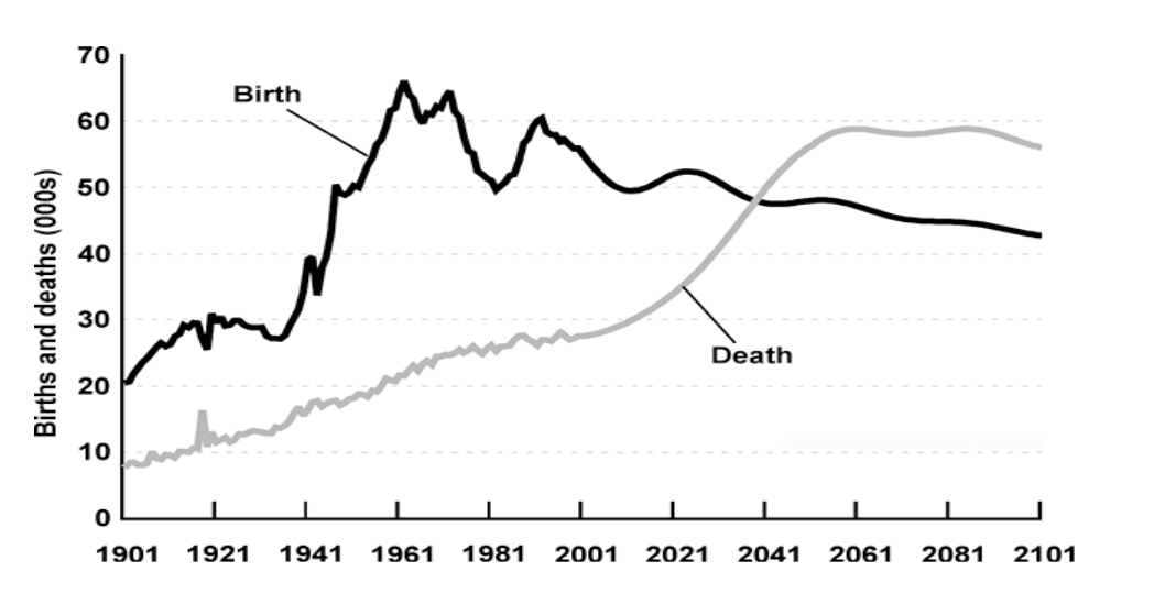
Answer: The line graph outlines the trajectory of birth and death rates in New Zealand from 1901 and projects trends up to 2101. Initially, the birth rate was substantially higher than the death rate, beginning at 20,000 in 1901 and peaking near 65,000 in 1961. After the peak, birth rates have seen ups and downs but remained within the 50,000 to 60,000 range. A notable decline in births is anticipated, dropping to about 42,000 by 2101. The death rate, in contrast, started around 10,000 in 1901 and has shown a steady rise. A significant surge in death rates is predicted post-2021, stabilizing around 60,000 between 2061 and 2081, with a slight decrease by 2101. The earlier wide gap between births and deaths is expected to narrow significantly, leading to an unprecedented shift where deaths may surpass births towards the end of the century.
Below discussed questions is from analytical paragraph class 10 PYQ which will help you to prepare for your class 10 CBSE exam.
Q.1 The graph given shows estimated sales of gold in Dubai in 2002. Write an analytical paragraph describing the line graph in around 150 words.
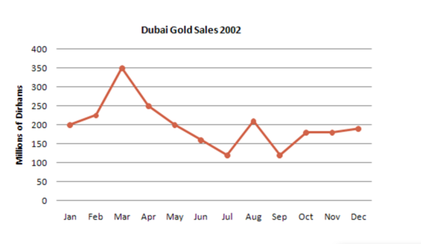
Answer: The line graph presents an analysis of gold sales in Dubai over the course of 2002, measured in millions of Dirhams. The year opened with sales at around 200 million Dirhams and displayed a rising trend, reaching a crest at 350 million Dirhams by March. This peak signifies a robust period for the gold market in Dubai. Subsequently, a decline was observed, with sales dipping to a low of 110 million Dirhams by July, illustrating a sharp fall in the market. Interestingly, there was a significant rebound in August, where sales momentarily doubled, only to fall back to the July figures in September. The remainder of the year saw the sales stabilize at 180 million Dirhams before a modest uptick in December.
Overall, the graph indicates a volatile year for the gold industry in Dubai, with peaks and troughs aligning with various economic factors or seasonal trends. The highest sales occurred in March, while July and September experienced the lowest. The year concluded with sales figures aligning closely to those at the commencement of the year, signifying a full-circle journey for the market within the twelve-month period.
Q.2 The chart shows the division of household tasks by gender in Great Britain. Write an analytical paragraph describing the chart given in not more than 200 words.
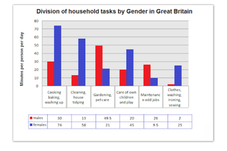
Answer: The chart delineates the gender-specific allocation of household duties in Great Britain, revealing a traditional division of labor. Women dedicate significantly more time to household chores, averaging around four hours daily, which is notably higher than the less than two and a half hours contributed by men.
Women lead in activities such as cooking, cleaning, childcare, and laundry, devoting roughly 200 minutes daily—triple the time men allocate to these tasks. Conversely, men exhibit a preference for outdoor and maintenance work, investing double the time compared to women in activities like gardening and various house repairs.
Interestingly, men's highest time investment peaks at nearly 50 minutes on gardening and pet care, while women allocate about 30 minutes to these tasks. A stark contrast appears in clothing care: men spend a mere 2 minutes per day on washing, ironing, and sewing, whereas women spend about 25 minutes.
In essence, the chart illustrates a pronounced disparity in the distribution of household responsibilities by gender, with women shouldering the bulk of indoor chores and men tending towards outdoor and maintenance-related tasks.
Q.3 You asked people what they thought was the most valuable thing. The given pie chart shows the analytics of the different answers you received. Write an analytical paragraph for a research project in 150-200 words.
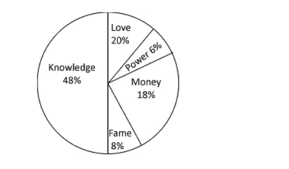
The pie chart in question offers a visual representation of people's perceptions of what constitutes the most valuable entity in life. This chart is a kaleidoscope of values, sliced into five distinct categories, each representing a different element deemed as most precious by the respondents.
Notably, 'Knowledge' emerges as the predominant value, claiming a 48% majority of the chart. This illustrates a significant inclination towards intellectual assets over materialistic or social standings, with nearly half the participants affirming that knowledge surpasses all other forms of value. In stark contrast, 'Power' appears to be the least favored, occupying the smallest section, suggesting a minimal number of individuals regard it as the pinnacle of value.
'Fame' treads closely behind 'Power', indicating a slightly higher but still limited endorsement as a valuable asset. Meanwhile, 'Love' and 'Money' demonstrate a near equal distribution, capturing 20% and 18% respectively. This balance suggests a common perception that emotional fulfillment and financial security are nearly equally significant, yet fall behind the intellectual prowess represented by 'Knowledge'.
In essence, the chart paints a picture of a society that places the highest worth on enlightenment and understanding, with 'Knowledge' at the vanguard. It indicates a moderate valuation of emotional and monetary fulfillment, while 'Power' and 'Fame' are perceived as lesser in the hierarchy of values. This data provides an insightful snapshot into the collective mindset, valuing wisdom as the paramount treasure.
Q.4 The given double bar graph shows the preferences of children in a school in playing different games over the span of six years. Write an analytical paragraph about the given information.
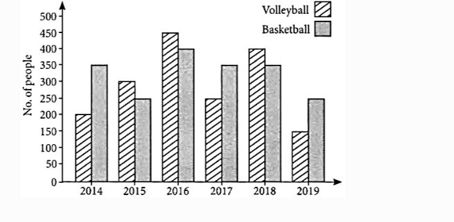
Answer: The double bar graph provides insight into the shifting game preferences among schoolchildren across a six-year span. Volleyball's popularity peaked in 2016 but notably dipped by 2019. In contrast, basketball maintained a steady interest level throughout the years, with minimal fluctuations. The graph indicates that volleyball saw a dramatic increase in interest in 2016, with a sudden rise in the number of children playing the game, yet this interest did not sustain and saw a drop in subsequent years.
Basketball, on the other hand, displayed remarkable consistency in popularity, with a slight increase in 2016, mirroring volleyball's peak year, before stabilizing. This consistent preference suggests basketball's enduring appeal among the children.
In summary, while volleyball experienced more significant highs and lows in popularity, basketball remained a constant favorite throughout the six years. The data suggests that despite volleyball's brief surge in popularity, basketball was the more consistently chosen sport among the schoolchildren by the end of the six-year period.
Q.5 The given pie chart represents the amount of money spent by a family on different items in a month. Write an analytical paragraph using the information given in the chart.
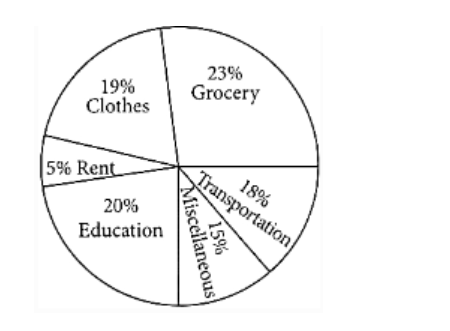
Answer: The pie chart in question details the monthly expenditure pattern of a family, highlighting their financial priorities and spending habits. The chart indicates that groceries constitute the largest expense at 23%, underscoring the family’s emphasis on home-cooked meals and the importance of nutrition. Education follows close behind at 20%, reflecting the family's commitment to learning and academic growth.
Clothing and transport are also significant expenses, accounting for 19% and 18% respectively, which suggests a balance between necessity and personal care. Meanwhile, 15% of the budget is allocated to assorted items, possibly encompassing leisure and lifestyle products like stationery and cosmetics. Interestingly, the least portion of their budget goes towards rent, which may imply a strategic decision to minimize fixed living costs.
In essence, the family’s budgeting choices show a strong inclination towards essential spending, with most of their outgoings directed at fundamental needs and responsibilities. The limited expenditure on miscellaneous items hints at prudent financial management, with the majority of the budget being conscientiously allocated to areas that support their sustenance, education, and mobility. This careful allocation suggests a disciplined approach to budgeting, with discretionary spending kept to a minimum in favor of essential expenses and long-term investments in education.
When writing an analytical paragraph, especially in subjects like English for Class 9 or Class 10, students often make a few common mistakes that can impact the quality of their work. These mistakes can be avoided with careful attention to detail. Here are some of the most frequent issues:
Remember, effective analytical paragraph writing involves clear expression of ideas and structured analysis. Practice regularly, and refer to various examples of analytical paragraph to improve your skills.
While headings are not mandatory for analytical paragraphs, they can be helpful in summarizing the topic or the main idea of the paragraph. In Class 10 exams, the focus is on clear, structured writing, so a heading may not always be required unless specified by the exam instructions.
Analyzing paragraph writing involves breaking down a topic, event, or subject into its components, examining each part critically, and presenting a detailed interpretation or explanation of how the components fit together. It requires reasoning and supporting details.
To write an analytical paragraph in Class 10:
A pie chart in CBSE Class 10 is a circular graph that is divided into slices to illustrate numerical proportions or percentages of a whole. Each slice represents a category's contribution to the total.
The format of analytical writing generally includes:
The format of an analytical paragraph includes:
To format an analysis paragraph:
How to write a paragraph in class 10?
To write a paragraph in Class 10:
To write a good analytical paragraph in English, start with a clear topic sentence, provide evidence to support your analysis, explain how the evidence relates to your topic, and conclude by summarizing your analysis effectively. Stick to the format and use clear language.
To write an analytical passage, start with a clear thesis, then provide evidence or examples for each point, and conclude by linking everything back to your main argument.
To write an analytical passage, start with a clear thesis, then provide evidence or examples for each point, and conclude by linking everything back to your main argument.