Table of Contents
CBSE Class 9 Maths Notes Chapter 14 Statistics Pdf free download is part of Class 9 Maths Notes for Quick Revision. Here we have given NCERT Class 9 Maths Notes Chapter 14 Statistics.
CBSE Class 9 Maths Notes Chapter 14 Statistics
1. Primary and Secondary Data: When the information was collected by the investigator herself or himself with a definite objective in her or his mind, the data obtained is called primary data.
When the information was gathered from a source which already had the information stored, the data obtained is called secondary data.
2. Raw Data: Let us consider the marks obtained by 10 students in a mathematics test as given below
55 36 95 73 60 42 25 78 75 62
The data in this form is called raw data.
3. Range: The difference between the highest and the lowest values in the data is called the range of the data.
Range = Highest value – Lowest value
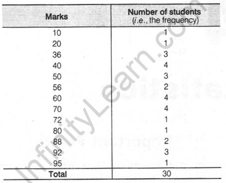
4. Ungrouped Frequency Distribution Table: Let us consider the marks obtained (out of 100 marks) by 30 students of class IX of a school
10 20 36 92 95 40 50 56 60 70
92 88 80 70 72 70 36 40 36 40
92 40 50 50 56 60 70 60 60 88
To make the data more understandable, we write it in a table as given below

This table is called an ungrouped frequency distribution table or simply a frequency distribution table. We can use tally marks in preparing these tables.
The number of students who have obtained a certain number of marks is called the frequency of those marks. In the above data, 4 students got 70 marks. So, the frequency of 70 marks is 4.
5. Grouped Frequency Distribution Table: Let us consider the following example of data collection.
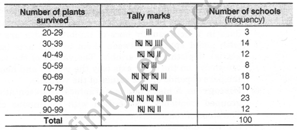
100 plants each were planted in 100 schools during Van Mahotsava. After one month, the number of plants that survived was recorded as
95 67 28 32 65 65 69 33 98 96
76 42 32 38 42 40 40 69 95 92
75 83 76 83 85 62 37 65 63 42
89 65 73 81 49 52 64 76 83 92
93 68 52 79 81 83 59 82 75 82
86 90 44 62 31 36 38 42 39 83
87 56 58 23 35 76 83 85 30 68
69 83 86 43 45 39 83 75 66 83
92 75 89 66 91 27 88 89 93 42
53 69 90 55 66 49 52 83 34 36
Using tally marks, the above data can be condensed in a tabular form as follows

(i) To represent such a large amount of data, we condense it into groups. These groupings are called classes as 20-29, 30-39.
(ii) The least number of a class is called the lower class limit and the greatest number is called the upper-class limit, as in 20-29, 20 is lower and 29 is an upper-class limit.
(iii) The difference between the lower and upper-class limit is called the class interval.
(iv) The mid-point of a class is called the class mark of the class. Thus,

6. Modified Table: In the frequency distribution table there are gaps in between the upper and lower limits of two consecutive classes. So, we need to divide the intervals so that the upper and lower limits of consecutive intervals are the same for this we find the difference between the upper limit of a class and the lower limit of its succeeding class, then add half of this difference to each of the upper limits and subtract the same from each of the lower limits.
e.g., Consider two consecutive classes 31-35 and 36-40.
Then, difference = 36 – 35 = 1
Half of the difference = \(\frac { 1 }{ 2 }\) = 0.5
So, the new class interval formed from 31-35 is 30.5-35.5 and from 36-40 is 35.5-40.5.
7. Graphical Representation of Data: There is another way of representing data which is called graphical representation of data. The main graphical representations are as follows
(i) Bar graphs: A bar graph is a pictorial representation of data in which usually bars of uniform width are drawn with equal spacing between them on one axis (say the x-axis), depicting the variable. The values of the variable are shown on the other axis (say the y-axis) and heights of the bars depends on the values of the variable.
(ii) Histogram: A histogram is a graphical representation of a grouped frequency distribution with continuous classes. The steps of. construction are as follows
- We represent along x-axis the class limits and frequencies along y-axis on a suitable scale.
- We now draw rectangles (or rectangular bars) of width equal to the class size and lengths according to the frequencies of the corresponding class intervals.
Since there are no gaps in between consecutive rectangles, the resultant graph appears like a solid figure. This is called a histogram.
Note:
- If the first class interval is not starting from zero, then we show it on the graph by marking a kink or a break on the axis.
- In’s histogram, the area of the rectangles erected are proportional to the corresponding frequencies.
- If the widths of the rectangles are varying, then we need to make certain modifications in the lengths of the rectangles, so that the areas are again proportional to the frequencies. The steps to be followed for this are as given below
- Select a class interval with minimum class size.
- Then, the lengths of the rectangles are modified to the proportional to the minimum class size. These lengths are called as ‘Lengths proportional to the minimum class size.’
(iii) Frequency polygon: For an ungrouped distribution, the frequency polygon is obtained by plotting points with abscissa as the variate values and the ordinate as the corresponding frequencies and joining the plotted points by means of straight lines. For a grouped frequency distribution, the abscissa of points are mid-values of the class-intervals. For equal class intervals, the frequency polygon can be obtained by joining the middle points of the upper sides of the adjacent rectangles of the histogram by means of straight lines.
Note: If both histogram and frequency polygon are to be drawn, then it is advisable first to draw a histogram and then frequency polygon.
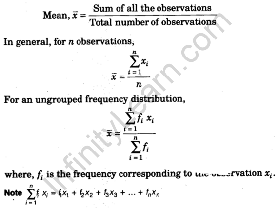
8. Mean: The mean (or average) of a number of observations is the sum of the values of all the observations divided by the total number of observations. Thus,

9. Combined Mean: If \(\bar { { x }_{ 1 } }\) is the mean of n1 observations and \(\bar { { x }_{ 2 } }\) is the mean of n2 observations, then their combined mean is

10. Median: The median is that value of the given number of observations which divides it into exactly two parts. Thus, the median is the middle-most score.
To Find Median: First of all the data is arranged in ascending (or descending) order. Then, the median of the ungrouped data is calculated as follows
(i) When the number of observations (n) is odd, the median is the value of the (\(\frac { n+1 }{ 2 }\)) th observation.
(ii) When the number of observations (n) is even, the median is the mean of the (\(\frac { n }{ 2 }\)) th and the (\(\frac { n }{ 2 }\) + 1) th observations.
11. Mode: The mode is that value of the observation which occurs most frequently, i,e., an observation with the maximum frequency is called the mode.
Extreme values in the data affect the mean. The median and mode are not affected by extreme values present in the data.
NCERT Notes for Class 9 Maths
- Chapter 1 Number Systems Class 9 Notes
- Chapter 2 Polynomials Class 9 Notes
- Chapter 3 Introduction to Euclid’s Geometry Class 9 Notes
- Chapter 4 Lines and Angles Class 9 Notes
- Chapter 5 Triangles Class 9 Notes
- Chapter 6 Coordinate Geometry Class 9 Notes
- Chapter 7 Heron’s Formula Class 9 Notes
- Chapter 8 Linear Equations in Two Variables Class 9 Notes
- Chapter 9 Quadrilaterals Class 9 Notes
- Chapter 10 Areas of Parallelograms and Triangles Class 9 Notes
- Chapter 11 Circles Class 9 Notes
- Chapter 12 Constructions Class 9 Notes
- Chapter 13 Surface Areas and Volumes Class 9 Notes
- Chapter 14 Statistics Class 9 Notes
- Chapter 15 Probability Class 9 Notes
We hope the given CBSE Class 9 Maths Notes Chapter 14 Statistics Pdf free download will help you. If you have any query regarding NCERT Class 9 Maths Notes Chapter 14 Statistics, drop a comment below and we will get back to you at the earliest.

